Modernizing Tradition: How Vinamilk Rebranded Without Losing Its Soul
- Anh Pham
- Jul 21
- 2 min read

Vinamilk, established in 1976, is more than a dairy brand—it’s a cultural icon in Vietnam. However, as consumer expectations evolved, the brand recognized the need to revitalize its identity while preserving its emotional core. In July 2023, Vinamilk unveiled a transformation that masterfully balanced nostalgia and bold modernity.
🧃 The Context: Why Change Now?
Vinamilk's previous identity focused on “The Faith of Vietnam” (from 1976 to 2015–2017) before evolving toward “Vietnam Rising High”—a mission-drive
n approach to position local nutrition on the global stage.
CEO Mai Kieu Lien emphasized that the 2023 rebrand was a strategic pivot—a first step in a five-year plan to modernize user experience, accelerate digital transformation, revamp internal processes, and better engage the next generation.
🎨 What's New with Vinamilk?
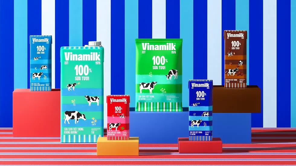
1. Logo & Typography
Transitioned from an emblem-style logo to a handwritten-inspired wordmark.
Logo is now larger, simpler, and includes “Est. 1976,” amplifying brand heritage.

2. Color Palette
Introduced “vibrant blue” and “creamy sweet” tropical tones to create familiarity with a modern flair, reflecting both tradition and youthful energy. Inspired by Vietnam's diverse food culture.
3. Visual System & Illustrations
Shifted from cartoon cows to minimalistic, lively milk illustrations.
Clean layouts focus on core messaging—simple, vibrant, and emotionally resonant.

4. Global-Ready Design
The flexible visual system and friendly typography are designed for international adoption, aligning with Vinamilk's global ambitions.
📊 Why It Resonated
Strategic Shift | Impact |
Refreshing for young consumers & beyond | Engaged Gen X, Z, and Alpha while retaining emotional ties with older demographics |
Social campaign & UX activation | Launch included interactive website feature allowing users to generate Vinamilk-style avatars |
Mental availability & brand saliency | Larger logo and vibrant colours increased brand recall and shelf visibility |
Cohesion across all touchpoints | Applied consistently across packaging, digital, and retail spaces—signaling a true brand transformation |
✨ My Perspective
Vinamilk’s rebrand is a powerful reminder that evolution trumps revolution. It honoured legacy—“Always being true to yourself”—while signalling bold confidence in the future through design choices that were energetic, relatable, and scalable.

The brand’s clarity of vision, combined with a creative system designed by a world-class team—including Megan Bowker (Creative Director) and local agency Studio DUY—ensured the outcome was both culturally authentic and globally competitive.
💡 What Marketers Can Learn
Evolve visually, don’t abandon heritage.
Align design with cultural context.
Boost logo prominence to anchor brand recall.
Use digital activations (e.g., avatar tools) to build buzz.
Ensure design consistency across all platforms.
Invest in a creative lead team with both global and local understanding.

Final Thought
Vinamilk’s identity refresh wasn’t a mere cosmetic upgrade—it was a purposeful reimagining. It balanced heritage with aspiration, crafted for a digital-first, globally connected era. And it sends a clear message:
"We respect our past, but we’re committed to the future."


Comments